Boost Conversions: 3 Easy Website Upgrades
Marketing, Website Conversion Optimization
3 Simple Website Conversion Upgrades to Turn Visitors into Leads
You don’t need a full redesign to improve website conversions. With a few focused tweaks, you can turn more visitors into leads and boost your results using the site you already have.
Why Small Conversion Upgrades Beat Big Redesigns
Full website redesigns are expensive, slow, and risky. Meanwhile, your visitors are on your site today. Strategic website conversion optimization lets you boost your results without redesigning your site by improving what already works instead of starting from scratch.
The three upgrades below are simple enough for most businesses and agencies to implement quickly, yet powerful enough to noticeably improve website conversions in a matter of weeks, not months.
Upgrade 1: Clarify Your Primary Call-to-Action on Every Key Page
Visitors rarely convert when they have to guess what to do next. To turn visitors into leads, every important page should have one clear, visually prominent call-to-action (CTA) that matches your main goal: book a call, request a quote, download a guide, or start a free trial.
Use direct, benefit-driven copy such as “Book a Strategy Call” instead of vague labels like “Submit.”
Make the CTA button stand out with a contrasting color that still fits your brand palette.
Repeat the same primary CTA in your header, mid-page, and at the bottom to catch scanners and skimmers.
💡 Pro Tip: If your analytics show healthy traffic but low inquiries, unclear or competing CTAs are often the silent culprit.
Upgrade 2: Add a Low-Friction “Next Step” for Cold Visitors
Not everyone is ready to talk to sales on their first visit. To improve website conversions naturally, offer a softer next step alongside your high-intent CTA. This gives hesitant visitors a way to engage without feeling pressured.
Create a concise lead magnet: a checklist, mini report, or case study relevant to your core service.
Gate it behind a short form (name + email) to turn visitors into leads you can nurture via email.
Position it near your main CTA with copy like “Not ready to talk yet? Download the guide instead.”
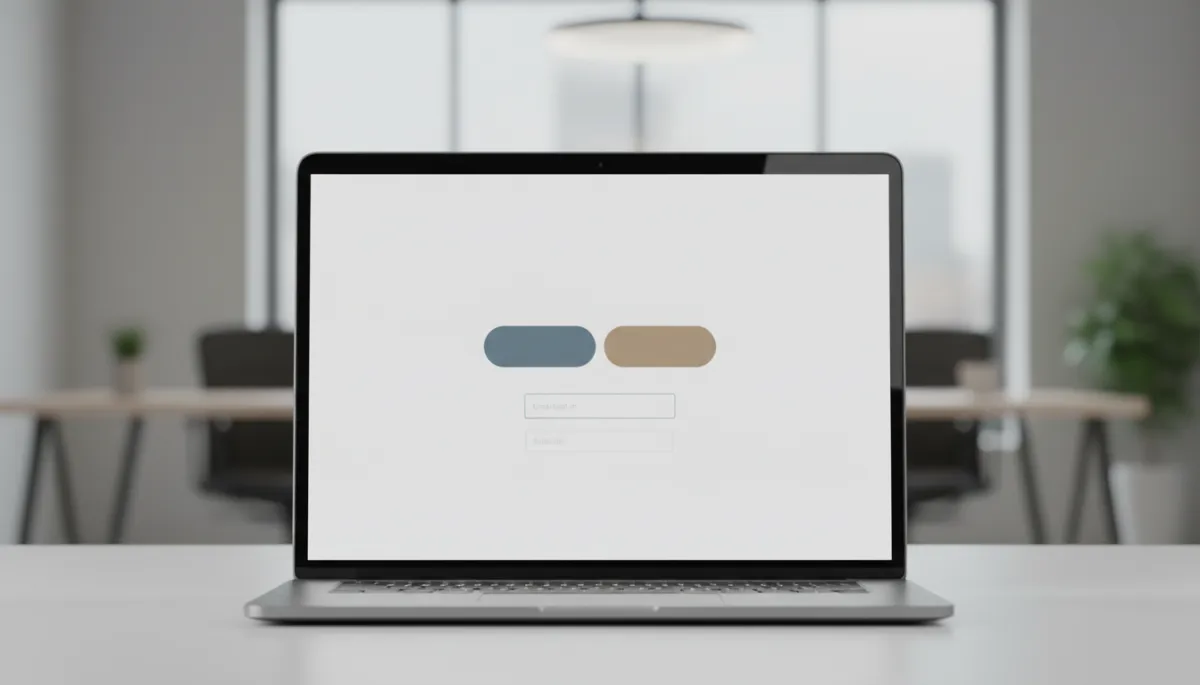
A low-friction lead magnet often doubles opt-in rates on high-traffic pages.
This single change helps you capture leads from visitors who would otherwise leave and never return, steadily increasing the number of qualified contacts in your pipeline.
Upgrade 3: Use Proof and Clarity Near Your Forms
When someone hovers over your contact or quote form, they’re moments away from converting. Strategic website conversion optimization here can dramatically increase completions without any visual overhaul.
Add one or two short testimonials or logos of recognizable clients next to the form to reduce perceived risk.
Clarify what happens next: “We’ll respond within one business day” or “You’ll receive your quote in under 24 hours.”
Remove non-essential fields; ask only for the information you truly need to follow up effectively.
📌 Key Takeaway: The closer a visitor is to submitting a form, the more every word of reassurance and clarity counts.
Bringing It All Together for Better Leads, Fast
These three simple upgrades—clear CTAs, a low-friction next step, and proof-packed forms—work together to turn visitors into leads consistently. They help you boost your results without redesigning your site, making the most of the traffic and content you already have in place.
For businesses and agencies, this approach to website conversion optimization is both practical and scalable. Start with one upgrade on your highest-traffic page, measure the impact, then roll the winning changes across the rest of your site to improve website conversions naturally over time.